I recently came across a compelling visualization of American healthcare costs vs. life expectancy, showing that the US is considerably outpacing other wealthy nations when it comes to spending on healthcare, but lagging behind when it comes to actually living longer.
This graphic paints a grim picture on two fronts. For one, wow US healthcare is expensive. But more importantly: why aren’t we getting anything for it? Why is American life expectancy so far behind other developed nations?
As it turns out, the answer is a bit complicated, but American life expectancy is not unilaterally worse than other nations, and our healthcare system seems to work fine once we are old enough.
A brief aside: What is life expectancy?
Simply put, how many years do we expect the average baby to live? Starting from year 0, what is the expected number of years left. There is a little bit of nuance here, because life expectancy is not really a fixed value, but rather it can be thought of as a value given a start year. Another way of phrasing our usual use of life expectancy is: Given that you have lived 0 years, how many more are you likely to live?
When phrased this way, we can think of life expectancy a bit differently. For example, given that you have lived 15 years, how many more are you likely to live? This question is different, because it erases infant mortality from the calculation, therefore raising the life expectancy of many nations. Given that you have lived 65 years, how many more are you likely to live? Again, this is a different question, and now we’re investigating how well a nation cares for its elderly, or how robust their senior- and end-of-life healthcare system is.
Life expectancy at birth over the last few decades
Given the above information, let’s look at life expectancy from birth over the last few decades. This should look something like the graphs we’ve seen before.
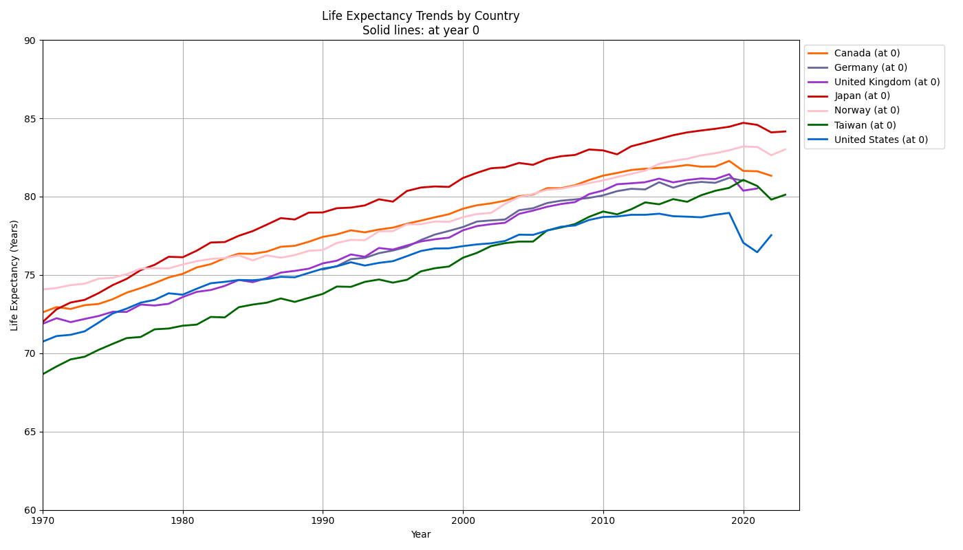
Looks familiar, and yikes it doesn’t look great for the US. In the last couple decades, American life expectancy from birth has significantly lagged behind other nations. Let’s pick a more recent year and compare individual nations more closely, rather than looking at how trends have evolved over time.
Yearly life expectancy across nations
We’ll pick a relatively recent year in the dataset to examine differences across countries more closely. So now we aren’t looking at trends over time, but just at differences for a single year. We’ll pick 2019 because it is before Covid, so data should be fairly “normal” for that year.
For this plot, I want to look at how life expectancy changes as an individual gets older. So we’ll have an individual’s current age on the x-axis, and then their life expectancy on the y-axis. This let’s us ask: Is there a point at which healthcare seems to be the same across countries? For example, if an individual reaches 80 in the USA or in the UK, are they equally likely to make it to 85? That would tell us that healthcare for seniors is roughly equivalent in the two nations, even if their life expectancy from birth is different.
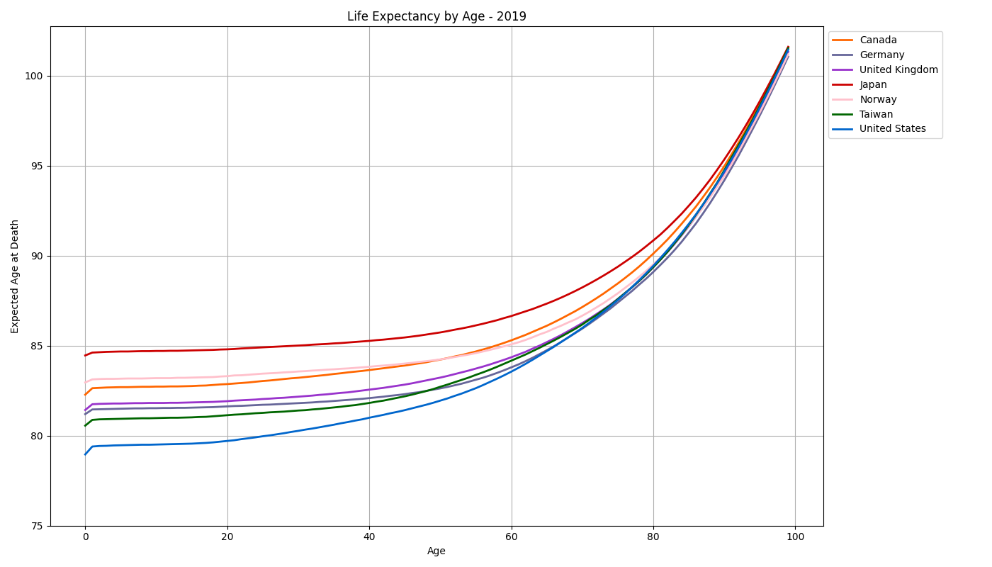
So it looks like yes! All nations seem to converge around 95-100, but most nations’ citizens have roughly the same life expectancy starting around maybe 60-70. The rate of increase for life expectancy seems to be highest for the US, indicating that younger citizens in the US are more likely than their international counterparts to die early, but older citizens in the US have a similar life expectancy to older citizens from around the world.
Let’s pick just 65 and zoom in on the difference from birth to 65 for each nation.
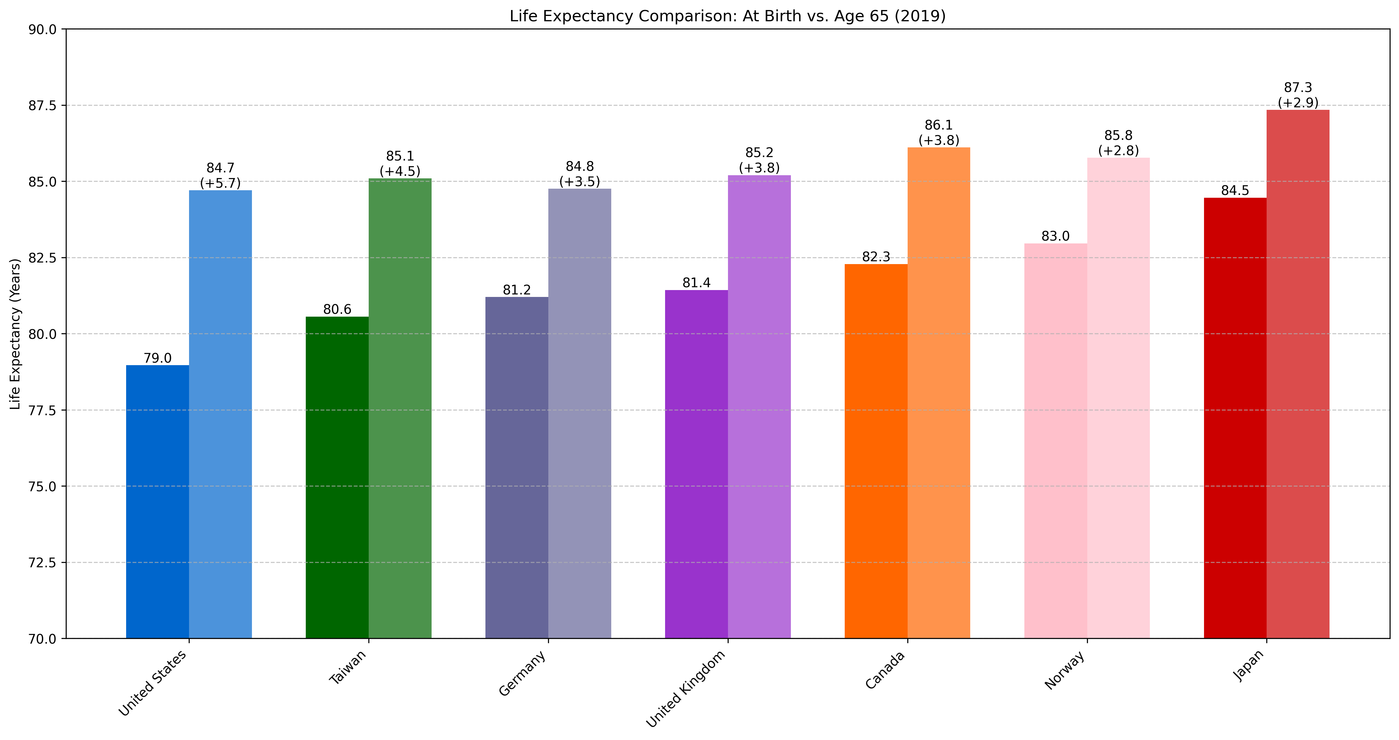
So yes, it looks like life expectancy at 65 is roughly equivalent for most developed nations (except for Japan, they’re doing something right over there). But the jump from birth to 65 is quite different across nations. While other countries are floating around the 2-4 year range, the average American’s life expectancy jumps 5.7 years from birth to 65.
What does this really mean?
Realistically, there could be multiple reasons that most nations have equivalent life expectancy when we start at age 65. For example, it could just be that, by 65, anybody who was in very poor health has already been “weeded out”, and now everybody is likely to make it to 85 and beyond. Maybe it has nothing to do with the quality of a nation’s healthcare, maybe it’s just down to the individuals that make it that far.
To test this, we can add another nation to the plot. Russia also has a suspiciously low life expectancy from birth, and is also not renowned for world-class healthcare. So if Russia’s life expectancy from 65 is also near 85, we can say that it is just a function of reaching 65. However, if Russia’s life expectancy is still short of other developed nations, we can say (with more confidence) that it is actually the healthcare systems “kicking in” at that age.
For this plot, we need to go back to 2014, as it seems that Russia stopped publishing data around 2015.
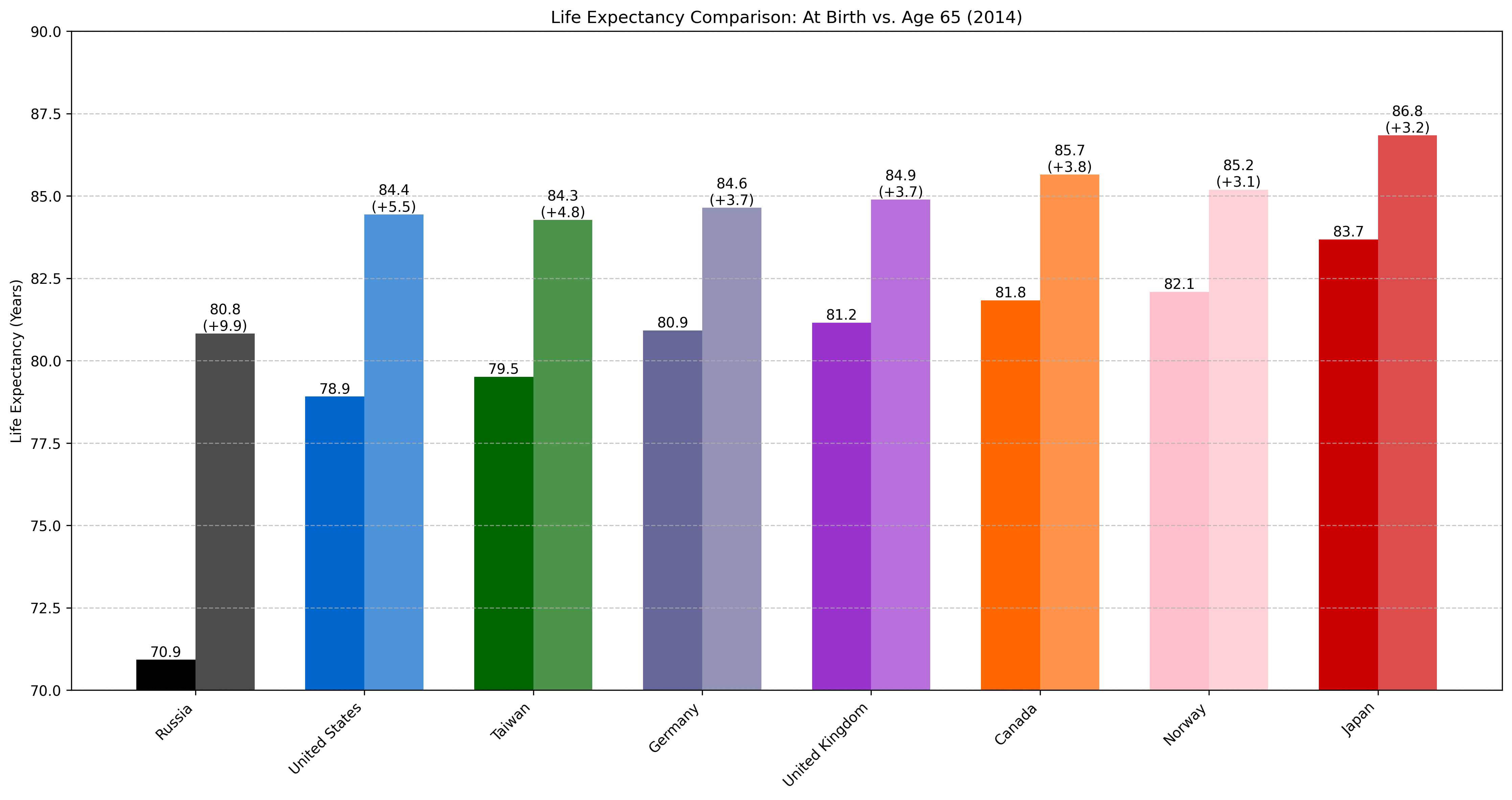
Quite a big difference! Not only does Russia gain a staggering 9.9 years by starting at 65, they also continue to lag behind all another nations by a significant margin. This indicates that it is healthcare systems or social programs in developed nations that are helping to keep their senior citizens around. In a less-developed nation with slightly worse care, life expectancy lags behind for seniors.
Takeaways & Conclusions
This was a fun and pretty interesting exercise. I was partly motivated to do this after being shown a podcast with a hospital CEO who claimed that American life expectancy was actually superior to other nations, once citizens reached a certain age. I’m not sure that I believe him, particularly when Japan is out there keeping a solid 5-10 year lead on the rest of us, but it is interesting to see that there is a bit more nuance to the discussion. Yes, our life expectancy from birth is woefully inadequate when compared to other developed nations. But somewhere around 60 years old, it starts to “kick in” and catch up with everybody else.
This may imply that we need to reframe some of how we think/communicate about healthcare and life expectancy in the US. The discussion should perhaps include some component of “Why are we dying so early compared to everybody else?” As we can see above, our healthcare system seems to be perfectly capable of providing equivalent care to the rest of the world, once we reach senior citizen status. So why isn’t it getting us there sooner? Or what else is intervening and killing us off early that isn’t present in other nations? I haven’t been able to ask some of these questions, partly because I don’t have data for the causes of death for these individuals (which could tell us why Americans are dying earlier than others).
Finally, this discussion is about lifespan but not healthspan, or years of healthy, comfortable life. We haven’t made any claims that one nation is living any more independently, happily, or securely than any other, only that they’re living longer/shorter.
Again all of the code and sources for the data are linked below, so please run some plots for yourself or look for places that I made mistakes!
References, Data, and Source Code:
I encourage any interested party to reproduce this work, check my data processing, and let me know if there are mistakes! The data I used can be downloaded from the Human Mortality Database (get the “All HMD Countries” zip, ~330 Mb).
- HMD. Human Mortality Database. Max Planck Institute for Demographic Research (Germany), University of California, Berkeley (USA), and French Institute for Demographic Studies (France). Available at www.mortality.org.
- Original data visualization that I wanted to dig into: https://www.reddit.com/r/dataisbeautiful/comments/1cu0qsg/oc_life_expectancy_vs_health_expenditure/
- Peter Attia interview with Tenet CEO Saum Sutaria: https://peterattiamd.com/saumsutaria/